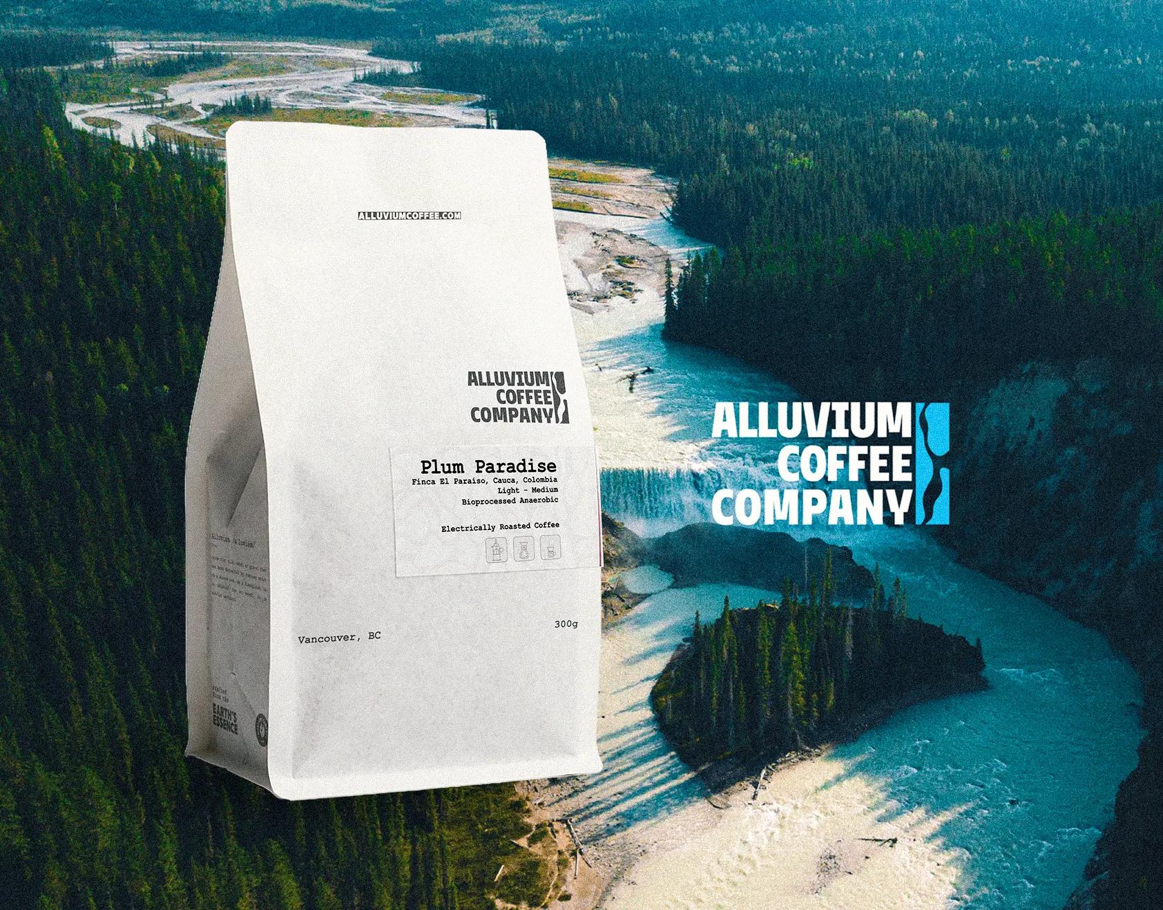
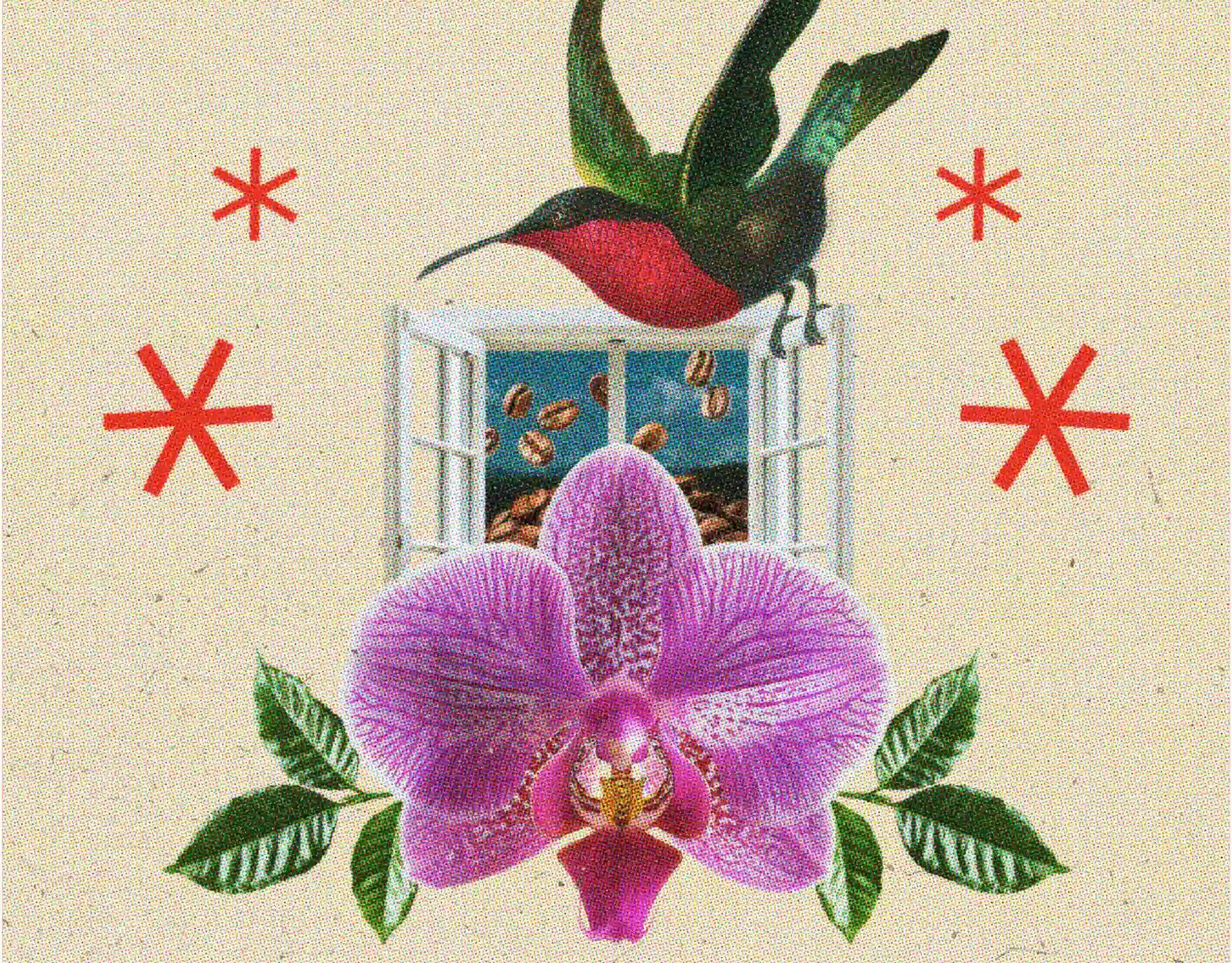
The project aimed to develop a visual system for a coffee brand that would not only operate in the coffee market but also convey origin, diversity, and permanence through its own visual language, reflecting industrial solidity, commercial openness, and cultural heritage all at once.
Our Solution
We designed a combination mark using a sans serif typeface with medium-high geometric contrast, paired with an isotype that opens the reading up to multiple meanings: coffee, origin, vital spark, and cultural energy. We built the palette from earth-given tones—deep greens, dark browns, and beiges—that anchor the identity in the organic and the agricultural, while intense orange and yellow burst in as a disruptive note that energizes the narrative, bringing contemporaneity and an urban feel that positions the brand as a cosmopolitan coffee. In some extensions we incorporated blues, which introduce freshness and sharper contrasts, keeping the system from being trapped solely in warm tones.
At Kiddo™ Estudio we love coffee, and for this visual system we set out to build a strong, compact language from the start; articulating a flexible system that reflects industrial solidity, commercial openness, and cultural heritage. A brand that not only operates in the coffee market but also projects origin, diversity, and permanence through its own language. We designed a logotype whose weight rests on a sans serif typeface with medium-high geometric contrast, paired with an isotype that opens the reading up to multiple meanings: coffee, origin, vital spark, cultural energy. The colors we chose were a gift from the earth. Deep greens, dark browns, and beiges anchor the identity in the organic and the rural, while intense orange and yellow burst in as a disruptive note that energizes the narrative. That chromatic friction gives it contemporaneity and an urban feel, pulling it out of the merely traditional and bringing it closer to a cosmopolitan coffee. In some extensions blues appear, introducing freshness and sharper contrasts, keeping everything from being trapped in warm tones alone.
The system works with variations that range from institutional to ornamental: secondary versions of the logo suite, frames and emblems that evoke stamps, labels, or travel insignias. For this, the brand speaks to us using secondary typefaces, adding warmth without breaking consistency. That same resource, tied to postal aesthetics, becomes a metaphor of origin and cultural impact: coffee as a product that travels, connecting origins and destinations.
Coffee Sources focuses on large-scale, industrial trade of green coffee, targeting established companies as well as new entrepreneurs looking to enter the world of specialty coffee and exotic origins. However, the brand also expands its commercial presence in supermarkets, specialty shops, and fairs with a specific line of roasted coffees — Lekempti and Harrari varieties.
The visual narrative had to respond to a brand that is technical and commercial, but also close to the end consumer in certain lines. That is why a graphic language was built, combining a robust typographic system with versatile applications for packaging, signage, corporate materials, and display.
Within this system, typography plays a crucial role. The main typeface used —TRUJILLO BT, developed by Colombian foundry Bastarda Type— brings personality to the imagotype and to the main titles. Its morphology, with firm contrasts and solid proportions, fits the idea of strength, clarity, and origin, functioning as a graphic anchor that consolidates the brand’s character without falling into the generic.
Beyond coffee, Coffee Sources also trades exotic spices from Ethiopia. For this line, we developed a differentiated graphic universe under the name Ethiopia Roots & Spice — Authentic Spice Heritage. The packaging, designed within the same brand system, conveys exotic refinement and a sense of heritage, evoking the sensory and cultural richness that accompanies these singular spices.
Manifesto
Coffee is more than a beverage, it's a bridge across cultures, an embrace of the traditions and a commitment to a stronger future.
From the rainbow tinted soils across the world, we honor every bean's journey, the gift of the land.
From bean to brew, in every sip of this liquid gold that unites us all lies a timeless ritual, a tribute to the earth, and a legacy we share.
Every bean tells a story, the bond between the hands that made it possible.
Together, we share the spirit of coffee
Together, we honor its journey
Together, we brew the world closer, one cup at a time.